Context
Eco Herbalist needed a stronger identity to stand out in a saturated wellness market.
A full visual identity system designed to build trust, consistency, and standout presence in the wellness market.
The brand needed stronger differentiation and clear visual rules across packaging, digital, and marketing touchpoints.
A complete guideline enabled consistent execution and faster rollouts across all customer-facing materials.
Eco Herbalist needed a stronger identity to stand out in a saturated wellness market.
Existing visuals felt generic and lacked consistent standards across touchpoints.
Create a distinctive brand system that builds recognition, trust, and conversion momentum.
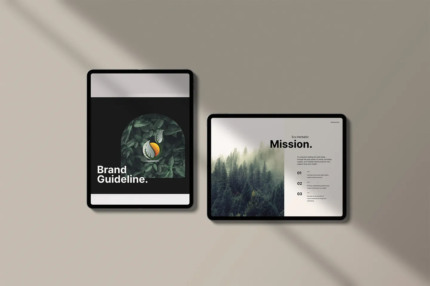
Deliver a practical, scalable identity manual for real-world implementation.
Eight clear delivery phases from discovery to post-launch support.
Brand goals, audience values, and competitive positioning were mapped upfront.
Market and visual landscape review identified differentiation opportunities.
Nature-led but premium design direction defined tone, mood, and visual intent.
Logo system, color strategy, and typography pairings were crafted for consistency.
Applications were tested across digital and physical contexts for coherence.
Core brand assets were prepared for web, social, print, and packaging use.
Rules and examples were documented to prevent drift and reduce revision cycles.
Final handbook and practical support enabled confident rollout across channels.
A deliberate typography and color system balanced warmth, readability, and premium perception across digital and print environments.
Clear application rules were created for layouts, imagery, and assets to keep the brand consistent regardless of channel or vendor.
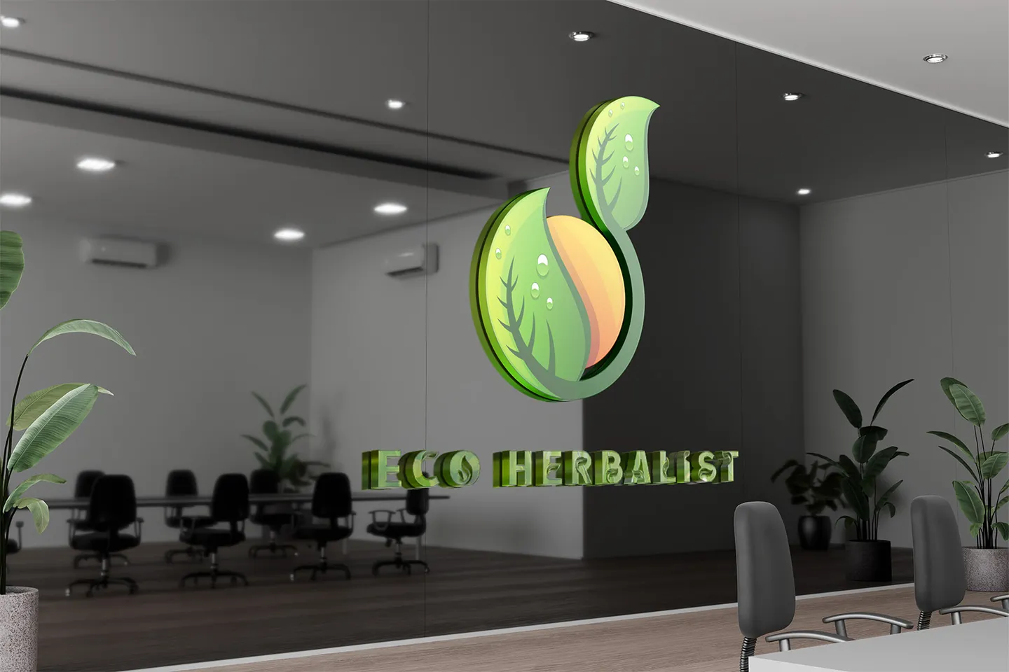
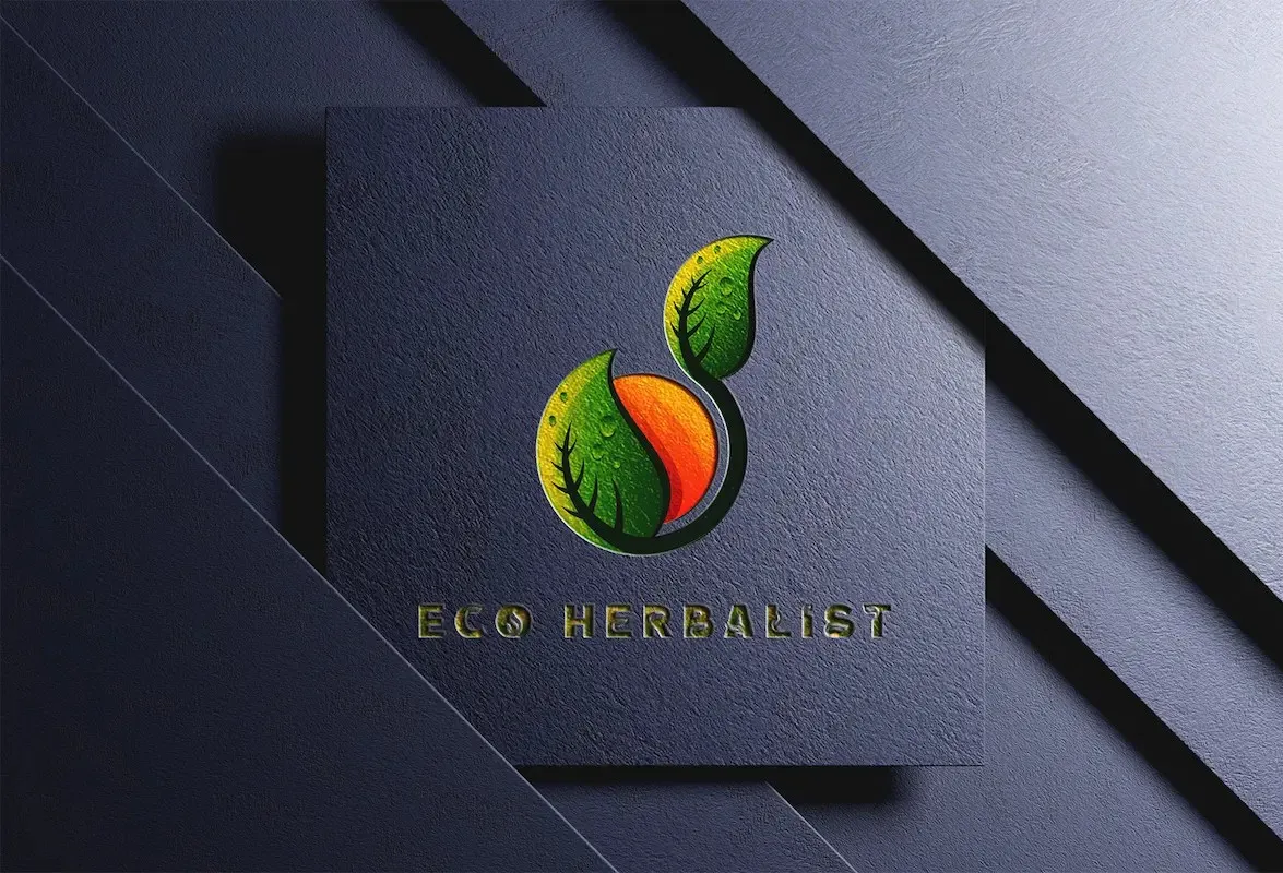
The identity was translated across social, web, packaging, and collateral so every customer interaction reinforces the same brand signal.
Outcomes
The branding system became a practical growth asset, not just a visual refresh.